



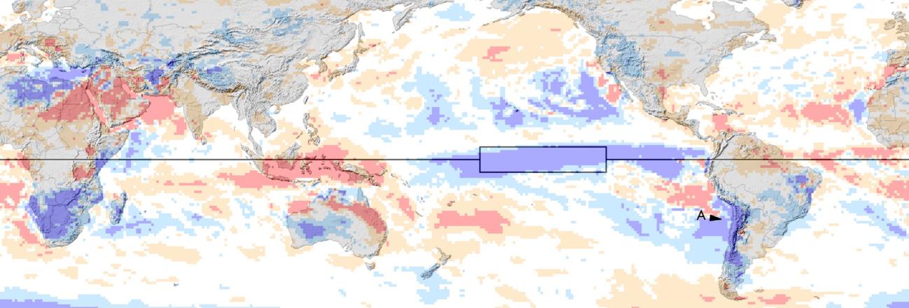
Global Precipitation During July to September of the 2026-27 El Niño
El Niño events occur every two to seven years, and they are driven by feedback between ocean currents and the circulation of the atmosphere over the tropical Pacific Ocean. Variation in ocean temperature and wind patterns drives variation in the rain and snow that falls over the tropical Pacific and elsewhere in the world. Many forecasts have been issued for the El Niño that started in the summer of 2026, and past El Niños have been extensively discussed during the months leading up to this one. One way that NASA contributes to the conversation is to provide, in near real time, estimates of how much precipitation falls over oceans and continents.
A few hours after September ended, NASA provided initial, near real-time estimates of July–September precipitation totals around the world. These three-month totals deviated significantly from seasonal averages in many places. For example, part of India this summer experienced its worst drought since 2015, another year when a strong El Niño was ramping up. Most strong El Niños start in spring or summer and last until the following spring, and so they are named after these two years, such as 2026–27.
Not every precipitation anomaly that occurs during an El Niño is caused by the El Niño, and it will take years of study for scientists to fully understand the story of the 2026–27 El Niño. Nonetheless, it is an important first step to measure precipitation globally and to identify the ways that, during the 2026–27 El Niño, precipitation differs from the long-term average. Such research can contribute to mitigating the societal harm that the current or a future El Niño could cause.
Three-Month Precipitation Totals from NASA's IMERG
The simplest way to evaluate the precipitation that fell this July through September is to compare it to the long-term average for this time of year. NASA monitors rainfall and snowfall in near real time using IMERG, the agency's data-processing algorithm that combines observations from all available satellites that observe the Earth at microwave or infrared frequencies. IMERG stands for Integrated Multi-satellitE Retrievals for the Global Precipitation Measurement (GPM) Mission. IMERG estimates global precipitation every 30 minutes at approximately 11-kilometer resolution (0.1°⨯0.1° in latitude and longitude). IMERG estimates are available from January 1998 onward.
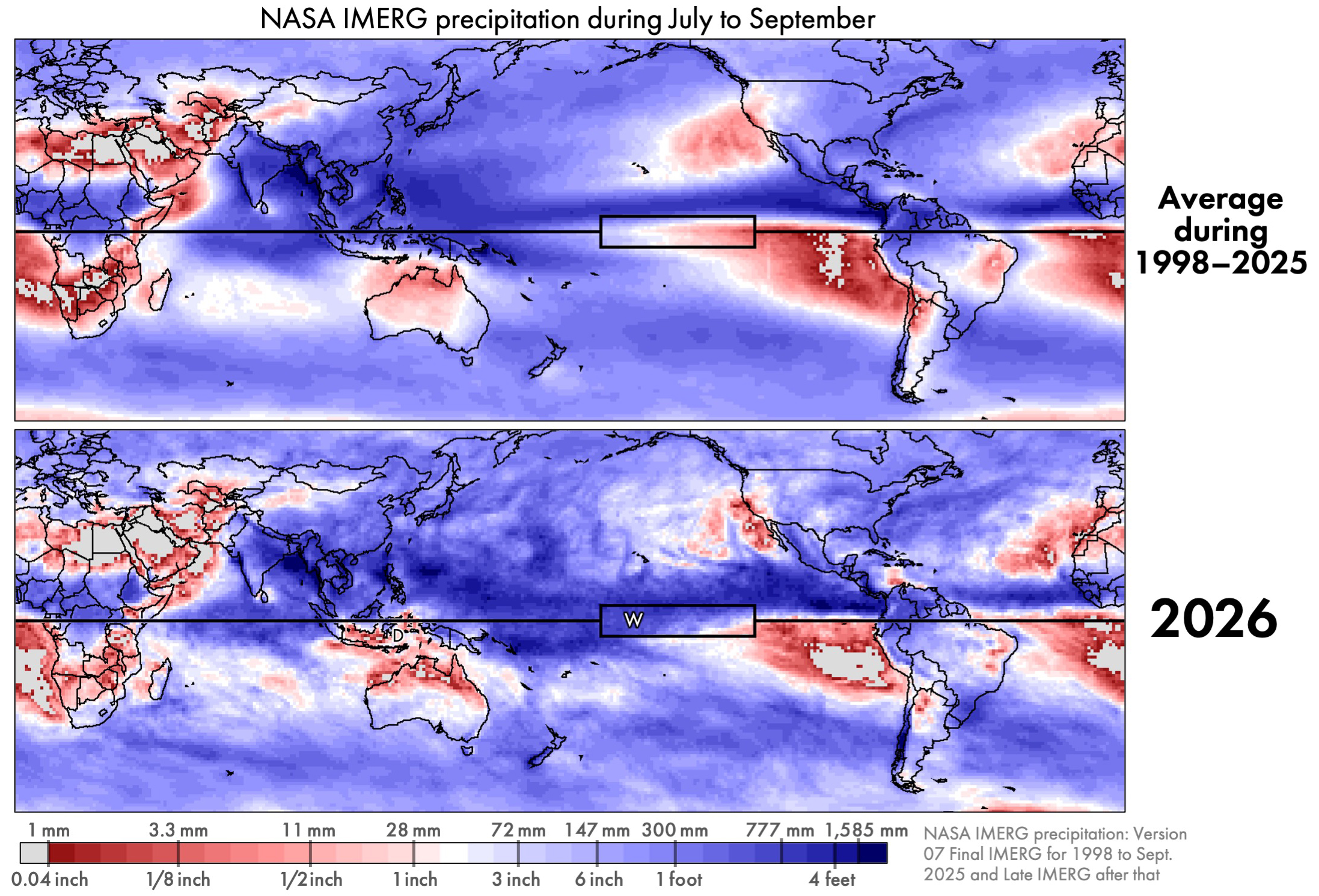
Figure 1. IMERG precipitation accumulation for July through September either averaging over 1998–2025 (top) or just during 2026 (bottom) [High-resolution image]
El Niño changes some aspects of global precipitation but is powerless to change other aspects of it. Regardless of the state of El Niño or other atmospheric oscillations, the approximate location of Earth's wettest and driest places remains about the same. And the range of annual accumulation is huge: about a factor of 100. The annual accumulation of rain and snow is under 1 inch in some places and over a 100 inches elsewhere (<25.4 mm vs. >2,540 mm). For July through September, Figure 1 shows deserts in light gray and the places with the most precipitation in dark blue. In these totals, any snowfall is represented by the depth it would have if it were melted.
Throughout the year, frequent storms near the Equator cause this region's rainfall accumulation to be among the largest on Earth. In the subtropics, there are several permanent patches of extreme desert over land or ocean. Despite the persistence of these large-scale precipitation zones, their boundaries do shift a bit throughout the year and from year to year. In Figure 1, the Equator is depicted by the black horizontal line. The box along the Equator is the Niño 3.4 region where sea surface temperature is monitored to determine when an El Niño event is occurring.
Unusual aspects of precipitation during 2026 can be seen in Figure 1, but not very clearly. Near the Equator, the three-month period of July–September 2026 saw more precipitation than average in the Central Pacific and less precipitation than average in the East Pacific. It is easier to see such differences if they are explicitly plotted.
Percent Difference and Absolute Difference
Examining two kinds of differences can help interpret the rainfall data: absolute difference and percent difference. An absolute difference is calculated by subtracting a reference values from current conditions, and it has units of millimeters of precipitation accumulation. Alternatively, one can display the percent difference between current and reference values. For the data examined here, the current conditions are the three-month accumulation from IMERG during July–September 2026 and the reference value is the average July–September accumulation from IMERG during 1998–2025. The difference between current conditions and the long-term average is often called an anomaly by atmospheric scientists. The use of the term anomaly does not mean that the observed difference is necessarily surprising or dangerous.
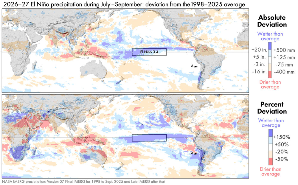
Figure 2. IMERG precipitation anomalies for July–September 2026: absolute difference (top) and percent difference (bottom) [High-res image]
![[High-res image]](https://gpm.nasa.gov/sites/default/files/2026-10/absAndPercentDeviationJulToSep2026.jpg)
In absolute terms, the two largest anomalies during July–September 2026 occurred near the Equator over the Pacific Ocean. Precipitation was 500 millimeter (20 inches) greater than average in part of the Central Pacific and 400 millimeters (16 inches) less than average in part of the Western Pacific. These features are dark blue and dark red, respectively, in the top panel of Figure 2.
If one looks only at absolute difference, then one will miss most of the precipitation anomalies that occur in arid regions. For example, consider the west coast of South America, and specifically Chile's Atacama Desert. This desert is identified by point A in the bottom panel of Figure 2. The absolute anomaly here is near zero (white in the top panel). Yet, a large relative increase in precipitation is seen in the percent-difference map (dark blue in the bottom panel).
Illustrating this point, the Chile meteorological agency reported that a particular rain gauge in the Atacama Desert receives an average of 4 mm (0.16 inches) per year of precipitation, but it received much more, 14.8 mm (0.58 inches), in August 2026. This gauge (#230001) is located along the west coast of South America. Consistent with this rain-gauge data, the satellite-based IMERG estimate was that the July–September 2026 rainfall total at this location was more than 150% above the long-term average.
It can be difficult for a satellite-based dataset to provide accurate estimates of precipitation in an arid location because there is so little precipitation to see there. One way to increase confidence in near real-time IMERG estimates is to compare them to an independent dataset that is also available in near real time. Within a few days of a month ending, the German meteorological service creates the GPCC First Guess dataset for that month, based on the limited number of rain gauges around the world whose observations are published in time to be included.
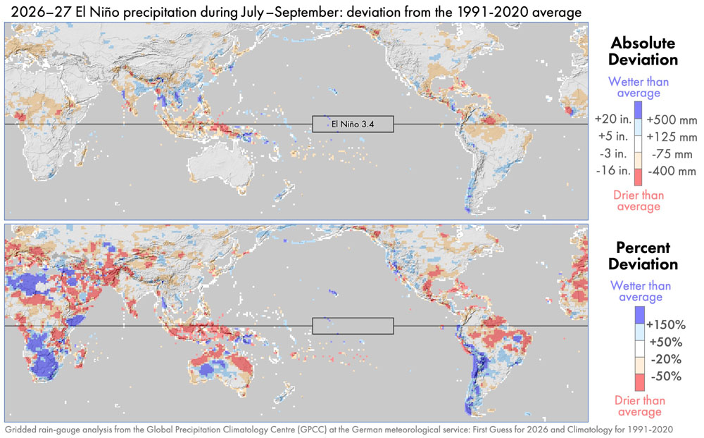
Figure 3. Precipitation anomalies for the same period as Figure 2 except using GPCC rain-gauge estimates rather than IMERG satellite estimates [High-res image]
![[High-res image]](https://gpm.nasa.gov/sites/default/files/2026-10/gpcpAbsAndPercentDeviationJulToSep2026.jpg)
One would expect global precipitation patterns to differ somewhat depending on whether they are based on observations from rain gauges or polar-orbiting satellites. Rain gauges continuously collect information throughout the day, but are separated by large distances. Polar-orbiting satellites fly over a location for just one instant, but they cover a region with a dense set of observations when an overflight does occur. Despite the different strengths and weaknesses of these instruments, gauge and satellite datasets show remarkably similar large-scale features in this case. During July–September 2026, both datasets show similar precipitation anomalies, comparing Figures 2 and 3. The two datasets generally agree on the sign of the large-scale precipitation anomalies on each continent and their approximately location.
Rain Over the Atacama Desert
According to IMERG, the Atacama Desert in northern Chile received precipitation during July–September 2026 that was 150% above the average amount for this time of year. In other words, 2.5 times normal precipitation fell: 100% of the normal amount plus an extra amount equal to 150% of the normal amount.
While the 2026 El Niño brought heavy rain to the Atacama Desert, this pattern was not following during the four strongest El Niños during 1998–2025. These four El Niños occurred in 2002–03, 2009–10, 2015–16, and 2023–24. Whether an El Niño is categorized as strong or not can depend on whether one is looking at the ONI or RONI index to measure it.
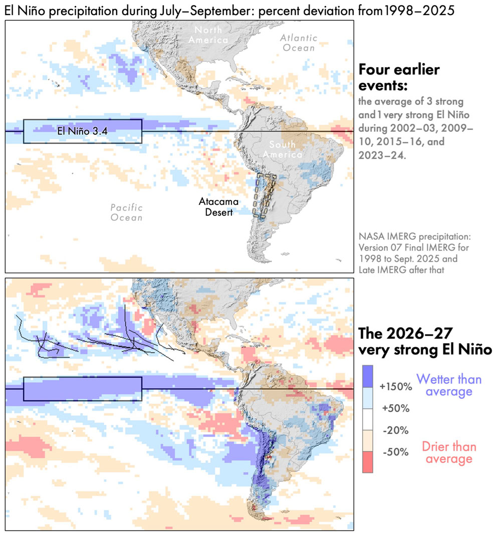
Figure 4. July–September precipitation anomaly during typical El Niño years (top) or during the El Niño that started in the summer of 2026 (bottom) [High-res image]
![[High-res image]](https://gpm.nasa.gov/sites/default/files/2026-10/ninoSouthAmericaJulyToSep.jpg)
The bottom panel of Figure 4 shows that the early months of the 2026–27 El Niño had far more precipitation over the Atacama Desert that was typical during prior El Niños (top panel of Figure 4). Much of this rain fell on a single day, namely August 18, 2026. The figure below shows a satellite overflight of the storm that brought this rain. The data was collected by the passive-microwave instrument on the Core Observatory satellite of NASA's Global Precipitation Measurement (GPM) Mission. The instrument is called the GPM Microwave Imager, or GMI for short. Microwave radiometers like GMI have the advantage of seeing into clouds to provide X-ray-like 2D images. In contrast, satellite instruments observing infrared radiation can only gather information about the height of cloud tops, which is a measurement that is only loosely tied to a storm's ability to produce heavy rain at the Earth's surface.
Figure 5 (below) is a false-color image generated using three frequencies of radiation measured by GMI, each one controlling the amount of red, green, or blue in the image. This visualization technique was first proposed by Negri et al. (1987). In the false-color image, GMI data over ocean is green-blue where the air column is dry and dark blue where the air column holds more water vapor. Over ocean, low clouds are black and high clouds are light gray. Cloud-free land is dark green-brown. The figure shows six GMI overflights, with the gaps between them filled with infrared satellite observations of cloud-top height.
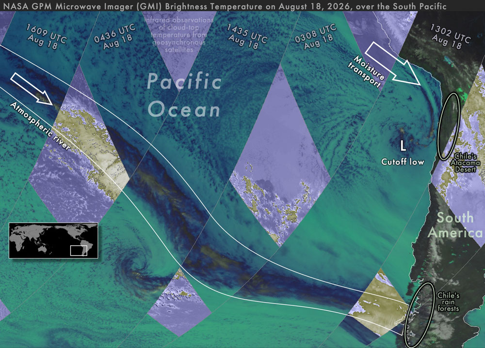
Figure 5. GMI observations of storms bringing rain to Chile on August 18, 2026 [High-res image]
![[High-res image]](https://gpm.nasa.gov/sites/default/files/2026-10/atacama20260818.jpg)
Labeled L in the figure, a cutoff low on August 18, 2026, was pulling humid tropical air south to fuel the precipitation over the Atacama Desert in northern Chile. Cutoff lows are fairly common off the west coast of South America, but this one formed a bit further north than usual (Fuenzalida et al. 2005). Cutoff lows contribute to the formation of a significant number of the rare, heavy precipitation events in several arid regions around the world (de Vries et al. 2024). Cutoff lows can be identified using the archive of upper-air charts at the University of Wyoming.
Also on August 18, an atmospheric river was bringing humid tropical air south to the forests of central Chile. An atmospheric river is a channel of fast-moving low-altitude air (a low-level jet) carrying water vapor to mid-latitudes. Most atmospheric rivers flow across the front edge of an advancing cold front (Dacre and Clark 2025, Figure 3). More atmospheric rivers than usual reach the southwestern coast of South America during El Niño years (Gibson et al. 2026, Figure 9).
Hurricanes and Typhoons
During July–September of almost every year, tropical cyclones form in three places: the North Atlantic, Northeast Pacific, and Northwest Pacific. These storms are called typhoons in the Northwest Pacific and hurricanes elsewhere.
Associated with the very late start to the 2026 Atlantic hurricane season was below-average precipitation in a large portion of the North Atlantic during this time. It was very unusual that 2026 saw no hurricanes in the North Atlantic during July–September. According to NOAA's records, 2026 was the first time in over a century that this happened.
During an average year, the Atlantic has seven hurricanes during the season that officially runs from June through November. There were two to four Atlantic hurricanes during three prior very strong El Niños, which were in 1982–83, 1997–98, and 2015–16. Another measure of hurricane and tropical storm activity is called ACE, which stands for Accumulated Cyclone Energy (NOAA 2026, footnote c). By the end of September 2026, the Atlantic value for ACE had reached only 11% of the value that typically occurs by the end of the Atlantic hurricane season. It was not until October 8, 2026, that Hurricane Isaias became the first Atlantic hurricane of the year.
The figure below shows the tracks of tropical cyclones as black lines using data from the National Hurricane center east of the International Date Line and from the Natyphoon website as compiled by Wikipedia west of the International Date Line.
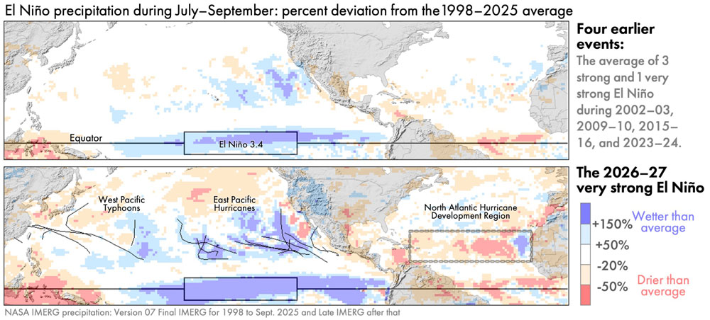
Figure 6. July–September precipitation anomaly over Northern Hemisphere oceans during typical El Niño years (top) vs. during 2026 (bottom) [High-res image]
![[High-res image]](https://gpm.nasa.gov/sites/default/files/2026-10/ninoTropicalCycloneJulyToSep.jpg)
In contrast to the North Atlantic, there was above-average hurricane activity in the East Pacific during July–September 2026. These hurricanes contributed to above-average rainfall there. An average year sees eight hurricanes in the East Pacific, and there was one more than that during July–September 2026. More importantly, the ACE index of hurricane activity, as of the end of September 2026, was almost double the average value at the end of an East Pacific hurricane season (95% above normal).
Despite the limited coverage of a single satellite instrument, a day's worth of observations can sometimes hint at the large-scale state of the atmosphere. For example, the GMI radiometer collected observations on September 4, 2026, that hinted at the active nature of this year's East Pacific hurricane season. GMI observed three East Pacific hurricanes that day, a rare occurrence in the instrument's data archive.
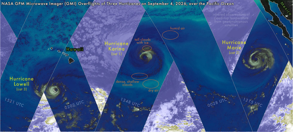
Figure 7. GMI observations of three hurricanes in the East Pacific on September 4, 2026 [High-res image]
![[High-res image]](https://gpm.nasa.gov/sites/default/files/2026-10/eastPacific20260904.jpg)
Global Comparisons to Other El Niños
During July–September 2026, the precipitation excesses and deficits were larger than those during the early months of the four prior El Niños that were classified as moderate to very strong. The global maps below reveal that, during these three months of 2026, there were several yet-to-be-discussed regions with precipitation anomalies that were large even by El Niño standards.
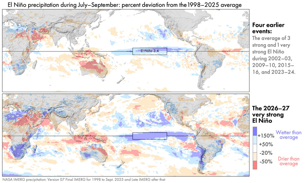
Figure 8. The July–September global precipitation anomaly for four prior strong El Niños and the analogous precipitation anomaly for the 2026–27 El Niño [High-res image]
![[High-res image]](https://gpm.nasa.gov/sites/default/files/2026-10/nino4priorVs2026.jpg)
For the most part, the location of precipitation anomalies in 2026 are similar to those in prior El Niños. It's just that their magnitude and geographic extent in 2026 are greater than during prior events.
Global maps of precipitation anomalies contain many details, and it can be difficult to determine which of these details are a distraction and which are important. To emphasize important details, researchers create schematic diagrams.
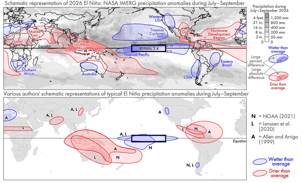
Figure 9. Schematic diagrams of El Niño's effect on precipitation: anomalies during July–September 2026 described in this article (top) or anomalies associated with prior El Niños during July–September (bottom) [High-res image]
![[High-res image]](https://gpm.nasa.gov/sites/default/files/2026-10/schematicJulSepElNinoPrecipAnom.jpg)
The top panel of Figure 9 is a schematic diagram that summarizes the anomalies seen in IMERG precipitation estimates. Light blue and red regions indicate percent anomalies, i.e., where there was much more or less precipitation than usual, expressed as a percent of a location's long-term average for July–September. Dark blue and red indicate regions where the 2026 anomaly was large in absolute terms, i.e., in units of millimeters of accumulation. The gray background provides context by showing the total precipitation accumulation during these three months in 2026. Regions where anomalies are large in absolute terms (dark red or blue) are generally a subset of the locations where it rains a lot anyway (dark gray).
The bottom panel of Figure 9 shows what three other authors identified as typical El Niño impacts on precipitation during July to September. Different schematic diagrams may agree in some places while disagreeing elsewhere. Such differences are to be expected because a schematic is inherently a simplification and is intended to emphasize certain aspects of a phenomena.
The three authors agree that, during this time of year, El Niños are associated with drought in Southeast Asia and Central America. They agree that El Niños are associated with above-average rainfall in the portion of the tropical Pacific defined as the Niño 3.4 region. Yet, these authorities disagree about where else precipitation anomalies are to be expected during an El Niño. In the bottom panel, the labels N, L, and A, refer to the anomalies identified by NOAA (2016), Lenssen et al. (2020), and Allen and Arrigo (1999).
The Columbia Climate School has published a different style of schematic that summarizes, in a single diagram, El Niño's precipitation impacts in every season, not just a single three-month period. Their diagram depicts the most widely known El Niño impacts, which might lead to confusion when reading the present article. The present article shows an unusually dry southern United States and wet southern Africa, yet the Columbia diagram suggests that the opposite is expected. The reason for the difference is that these features in the Columbia diagram are anticipated later in the year, not during the July–September period covered in the present article.
Instead of comparing different authors' schematic diagrams, one could evaluate the reasonableness of the IMERG-estimated El Niño impacts by comparing them to the output of an atmospheric model. On June 21, climate researcher Erik Kolstad wrote about a forecast from the ERA-5 model, which is version 5 of the reanalysis model developed by the European Centre for Medium-Range Weather Forecasts (ECMWF). One of the ERA-5 forecast maps is show below, along with a reprojection of the IMERG data discussed in the present article.
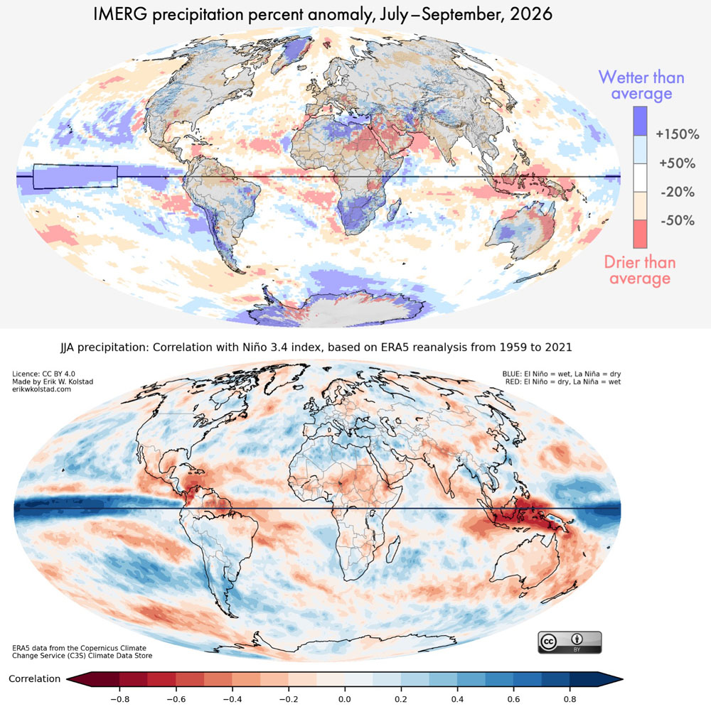
Figure 10. The 2026–27 El Niño's impact on precipitation as IMERG observed in July–September (top) or as ERA-5 forecasted would occur during June–August (bottom) [High-res image]
![[High-res image]](https://gpm.nasa.gov/sites/default/files/2026-10/elNinoIMERGvsERA5.jpg)
The bottom panel of Figure 10 shows results from the ERA-5 model. Covering June–August 2026, the figure shows where ERA-5 forecasted that precipitation anomalies would be positively correlated with Niño 3.4 sea surface temperature (SST) anomalies. Where precipitation and SST are positively correlated, one should expect above-average rain accumulation during an El Niño. Where these quantities are negatively correlated, one should expect below-average rain accumulation during an El Niño. The top panel of Figure 10 shows the previously discussed IMERG precipitation anomalies for July–September 2026. Excluding locations near the North or South Poles, the sign of the precipitation anomaly is the same in many places when IMERG and ERA-5 are compared.
Variation in Societal Impact
The magnitude of a precipitation anomaly does not, by itself, determine the magnitude of societal harm, such as to the economy or infrastructure. Other factors modify disaster risk, including population density and how susceptible local infrastructure is to extreme weather (Carrao et al., 2016). To summarize the preceding discussion, some precipitation anomalies during July–September 2026 are listed below along with a brief statement about their societal impacts.
IMERG estimated that parts of southern Africa and western Australia had more than double their normal precipitation during this period, but there were no reports that the extra precipitation caused any major catastrophes (ABC News, 3 Oct 2026). IMERG also estimated more than double normal rainfall over Chile during this part of 2026, and damaging floods were reported there (Reuters, 28 August 2026; Mining Reporter, 21 July 2026).
IMERG estimated a 20% deficit of rainfall over western India during July–September 2026. The media reported that India's harvest was the worst in a decade, which caused hardship (Down to Earth, 30 Sep 2026; South China Morning Post, 1 Oct 2026). Based on a dense network of thousands of rain gauges, the Indian Meteorology Department provided independent confirmation of this part of the global pattern seen by IMERG. During June through September, the Department estimated that rainfall was about 10–30% lower than average over most of India's subdivisions in the western third of the country (IMD 30 Sep 2026, Figure 3a).
Similarly, IMERG estimated a more than 20% deficit of rainfall over Southeast Asia during this part of 2026. The media reported a drought here that caused water shortages and threatened food security (PBS News Hour, 22 Sept 2026).
In 2026, much of the eastern Sahara Desert and Saudi Peninsula had less than half of their normal July–September accumulation, yet there were no reports of major economic harm from a drought. Confirming this part of the global pattern seen by IMERG, a near real-time rain-gauge dataset (Figure 3) reported rain deficits of ≥50% in similar areas in the Middle East and Southeast Asia. Extremely arid portions of the Middle East do not depend on current-year rainfall for drinking water, and rain-fed agriculture is an insignificant part of their economy.
The patterns described in this article are based on NASA's precipitation estimates made in near real time, which means within about 15 hours of when the satellite observations were collected. These estimates were made independently of rain-gauge observations for the current month because it takes several months for a quality-checked global archive of monthly rain-gauge accumulation to become available in a form that the IMERG algorithm can use as an input. NASA generates these real-time satellite-based estimates using a simplified algorithm called the Late Run of IMERG. The analysis in this article should, therefore, be considered preliminary, subject to revision once the Final Run of IMERG becomes available in several months.
Final Thoughts
El Niño is one of the Earth's many oscillations and cycles that affect precipitation and that occur naturally on time scales of a day to several years. NASA's IMERG algorithm provides global, near real-time estimates of precipitation that are useful, among other things, for monitoring the El Niño that is expected to last from summer 2026 to spring 2027. Looking further into the future, NASA scientists have aspirations, during the next decade, of creating a more advanced algorithm for estimating global precipitation. The new algorithm would incorporate recent scientific advances and computational techniques.
Credit: Imagery and story by Owen Kelley (NASA PPS / GMU CEOSR).