



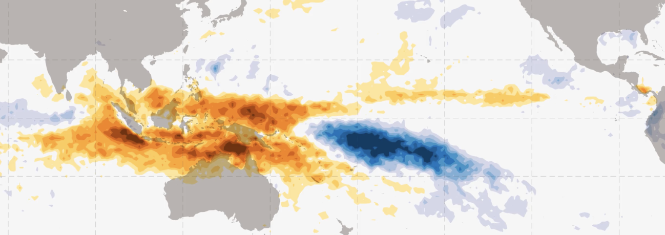
Oscillations in Global Precipitation
Whether or not it rains a week from now where you live may seem mostly random, but a long enough data record will likely reveal rainfall patterns that repeat over hours, months, or years.
Atmospheric scientists describe some of these repeating patterns as cycles and others as oscillations. There are annual and daily precipitation cycles tied to the variation of the sun's path across the sky [1]. An example of precipitation affected by time of day is that summer thunderstorms occur predominantly in afternoon or early evening along the East Coast of the United States. An example of seasonal precipitation is that the U.S. Southwest has mountains receiving most of their precipitation as winter snowpack and lower-elevation areas receiving most of their precipitation in late summer. A prior article on the GPM website describes how precipitation cycles are tied to the sun.
This article describes two precipitation oscillations that impact the economy [2]. In most cases, atmospheric scientists use the term oscillation rather than cycle to describe less regular but repeating patterns that are driven by hard-to-predict and complex processes in the atmosphere and ocean [3].
A good dataset for studying precipitation oscillation is IMERG, which is created by NASA's Global Precipitation Measurement (GPM) Mission. IMERG stands for Integrated Multi-satellitE Retrievals for the GPM Mission. Starting with January 1998, IMERG provides estimates of the rate of rainfall and snowfall every half hour and every 0.1 degrees of latitude and longitude. This resolution equates to individual measurements covering areas about 7 miles across or smaller.
The best known precipitation oscillation may be El Niño, which is a Spanish word, so Niño is pronounced "neen´ ee-oh." For centuries, sailors have used the term El Niño to refer to events when the ocean off Ecuador's coast is unseasonable warm in December. In the 1960s, scientists realized that El Niño events were part of a larger phenomenon that also includes the Southern Oscillation. The Southern Oscillation is characterized by a variation in wind and pressure in the Equatorial Pacific. It can alter the strength of India's summer monsoon rain among other effects [4]. India closely monitors the monsoon because food insecurity may result if the monsoon fails one year or is marked by more flooding than usual. To describe the full El Niño / Southern Oscillation system, scientists use the acronym ENSO.
In some parts of the world, another oscillation is also well known, specifically the Madden-Julian Oscillation (MJO). In countries where rainfall is particularly affected by the MJO, such as Australia, weather reports mention it regularly. When a strong MJO event unfolds, it can intensify the impacts of ENSO in some places and mask them elsewhere.
Both ENSO and MJO will be discussed in more detail below. Incidentally, scientists pronounce ENSO as a word, as in "en´ sew," while they pronounce MJO letter-by-letter, as in "M J O."
Monitoring Atmospheric Oscillations
An atmospheric oscillation repeatedly passes through a set of well-defined phases, but the duration of an individual phase can vary and sometimes the phases occur out of their normal order. These recurring phases are each associated with a complex pattern of air pressure, wind, temperature, and precipitation. To make it easier to identify which phase exists at any given time, an index is calculated from observations using an agreed-upon formula. As scientists improve our understanding of the atmosphere, they propose new formulas to serve as oscillation indices.
The phases of an oscillation may be named or numbered, as shown below for the first years of the IMERG dataset. Click here for a plot that covers a longer period.
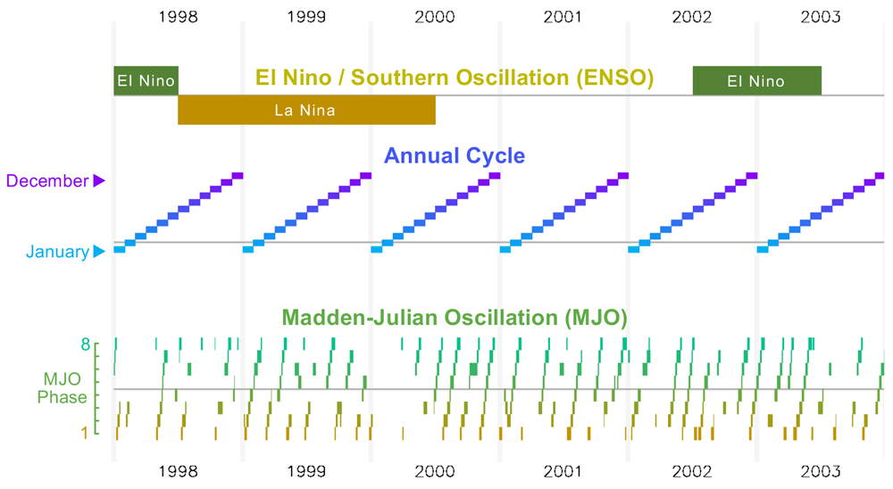
During 1998 to 2003, the phases of ENSO (top) and the Madden-Julian Oscillation (bottom). The cycle of the months of the year is shown in the middle.
The three phases of ENSO are named El Niño, La Niña, and neutral. Since the 1990s, a frequently cited index for ENSO is the deviation from average conditions of the ocean surface's temperature in a region of the central Pacific. This region of the ocean is called Nino 3.4, and it covers 5°N–5°S latitude and 170°–120°W longitude. NOAA uses buoys and ship observations to precisely measure the ocean's temperature. Because several oscillations operate on a similar time scale as ENSO, the index for ENSO is based on observations in the region that best isolates the ENSO signal.
Instead of having names, the eight phases of the Madden-Julien Oscillation are numbered 1 through 8. Over the past decade, an index called OMI has been widely adopted to calculate if one of the MJO phases is present or if the atmosphere is in an inactive state with respect to the MJO. OMI stands for the outgoing longwave radiation (OLR) MJO index. Using satellite observations, the OMI compares current observations of global cloud-top temperature against precalculated patterns. These precalculated patterns were generated from cloud-top observations spanning many years [5]. These patterns capture the strongest variation in cloud-top height globally, on the time scale of several weeks to months. A global index, rather than a regional one, works for identifying the phase of MJO because the MJO is the strongest oscillation at this time-scale anywhere on Earth [6].
Oscillations that Repeat Every 2 to 7 Years
It usually takes ENSO 2 to 7 years to pass once through its two active phases, El Niño and La Niña.
ENSO's impact on precipitation is best seen in anomaly maps. To calculate an anomaly, first calculate a map of the average precipitation during El Niño years and a separate average for La Niña years. From these two maps, subtract the long-term average annual accumulation at each location over a long period that includes El Niño, La Niña, and neutral years.
It is worth noting that using the term anomaly for the precipitation variation associated with El Niño does not imply that anything unexpected, alarming, or mysterious is occurring. In atmospheric science, an anomaly is merely a statement that current conditions deviate from average conditions. Anomalies occur all the time basically everywhere because rain in any given year is almost always at least a bit more or less than the long-term average.
One way to ensure that an anomaly map reveals the full geographic range of ENSO is by using units of percent deviation from each location's average precipitation accumulation. Percent deviation highlights different features than does an anomaly map expressed in absolute terms, with absolute meaning millimeters of precipitation per year. It rains a lot each year near the Equator, and there are large variations in the absolute amount of rainfall there from one year to another. The absolute amount of rainfall is generally much less over the rest of the Earth, but the percent change in rainfall can be just as large from year to year. A large percent change can have a large impact on agriculture and ecology, so a percent-anomaly map is a useful tool both near and far from the Equator.
The following figure shows a percent-anomaly map for El Niño and another for La Niña. To generate this figure, only moderate and strong events during 1998–2025 were included in the calculation [7]. Dark red or blue indicate a large anomaly, which in this context means accumulation that is 50% below or above a location's average annual accumulation.
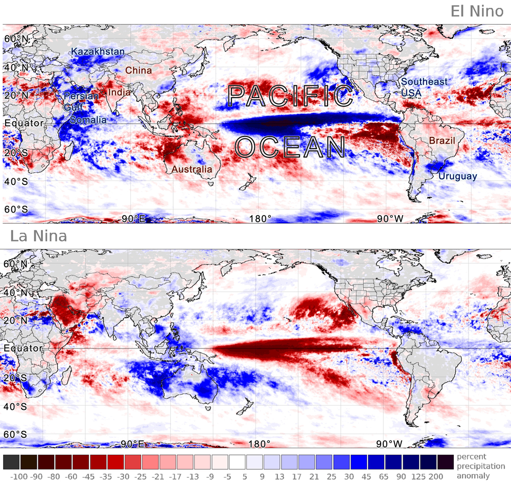
The precipitation anomaly during El Niño or La Niña years seen in IMERG data during 1998–2025
The IMERG image above shows that El Niño and La Niña both alter precipitation in locations far from the Equatorial Pacific. Scientific studies have documented impacts in California, Brazil, and Nicaragua (Chavda et al., 2023; Tien et al., 2025; Mendez-Rivas et al. 2024). The El Niño image above suggests that El Niño is associated with increased precipitation over East Africa, the Persian Gulf, and Central Asia. To the east, it is associated with decreased precipitation over India, central China, and Australia. Further east, it is associated with increased precipitation over the southeastern United States and Uruguay and decreased precipitation over Brazil.
In July 2026, NOAA forecasted an 82% chance of a very strong El Niño occurring in the autumn of 2026. If a very strong El Niño does start in 2026, it would be only the second time since the IMERG dataset began in 1998. The other time was in 2015–16 [8]. The previous very strong El Niño reached maximum strength during the autumn of 1997, a few months before the IMERG dataset began.
The many years that separate strong El Niño events should be considered when designing a multi-satellite precipitation-estimation algorithm like IMERG. Such an algorithm should be designed to use input data that is available over a period that is long enough to contain an adequate sample of the full range of possible ENSO conditions.
Oscillations that Repeat Every 20 to 90 Days
The Madden-Julien Oscillation is a disturbance in which a large, loose cluster of storms interact with large-scale wind patterns and ocean circulation. The MJO's strongest signal is generally near the Equator in the western Pacific. To put the MJO in context, it is sometimes described as a rapid oscillation superimposed on a slow oscillation; the slow oscillation being ENSO. Generally speaking, the MJO takes about 20 to 90 days to pass once through its eight phases. Scientific studies have used IMERG to study the MJO [9].
The MJO was named after two scientists who drew attention to it in a 1971 paper. Today, the MJO is tracked by weather forecasters and atmospheric scientists because, among other things, it impacts tropical cyclones and other severe weather. For a few weeks every few months, the phase of the MJO may increase the likelihood of occurrence and severity of tropical cyclones in part of the world [10]. But when the MJO is inactive, no such impacts occur.
Dangerous impacts may occur when the enhanced precipitation associated with the MJO passes over a region that is already experiencing enhanced precipitation because of ENSO. When the two oscillations reinforce each other, the situation is somewhat analogous to how rough seas cause more coastal damage during high tide. In this analogy, individual waves are the rapid oscillation and the tide is the slow oscillation.
To generate the MJO animation shown below, several mathematical transformations are applied to IMERG precipitation estimates. These transformations isolate the 20-to-90-day signal from other precipitation oscillations that proceed more slowly or rapidly [11].
A pair of animations showing the precipitation anomaly during the eight phases of the 20–90-day oscillation during the Northern Hemisphere winter (top) and summer (bottom)
The geographic pattern of precipitation anomalies that repeat every 20–90 days is influenced by the season (Kiladis et al. 2014). For this reason, many scientists now use a different term for the 20–90-day oscillation during the two halves of the year. This practice follows the recommendation of Shukla (2014) that the term MJO be reserved for November through April, while the term Monsoon Intraseasonal Oscillation (MISO) be used during the other half of the year.
Several indices have been proposed for determining which, if any, phase of the 20–90-day oscillation is active on a particular day. One popular index is called OMI and it is sensitive to tall, vigorous convective rain cells. Such storms are more common during summer than during winter. For this reason, the hemisphere experiencing its warm season tends to be the hemisphere with the largest 20–90-day anomalies. During phase 1 of the oscillation, the animation above shows that Northern Hemisphere summer (bottom panel) experiences increased precipitation over the East China Sea and south of Mexico, and decreased precipitation over India. During Southern Hemisphere summer (top panel), phase 1 exhibits an increase in precipitation northeast of Fiji and over Brazil, and a decrease just north of Australia.
Scientists use various techniques to visualize the MJO, one of which is longitude-time diagrams. The longitude-time diagram below shows that the precipitation enhancement (blue) moves to the right (toward the east) along the Equatorial Indian and Pacific Oceans as the MJO phase passes from 1 to 8.
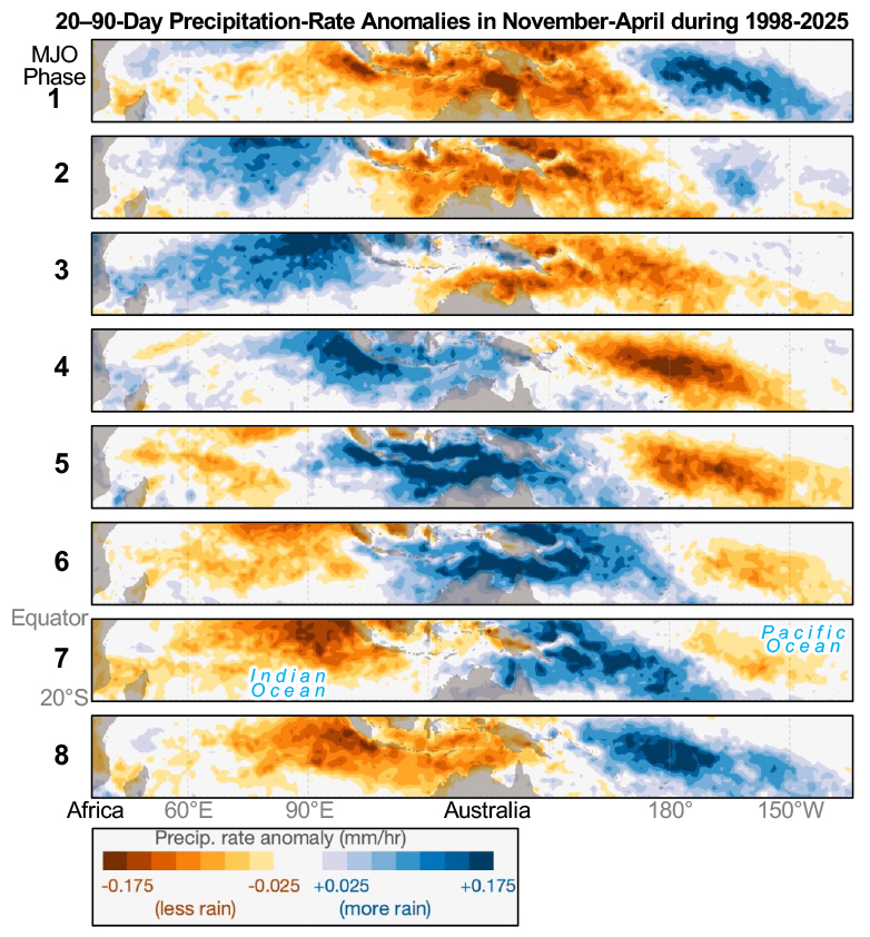
A longitude-vs-time cross section of IMERG precipitation anomaly along the Equator associated with the phase of the MJO during 1998–2024
One method for checking the validity of satellite-observed precipitation is to compare it against observations made with weather radars on the ground. This technique works only over the small portion of the Earth within range of a ground radar. The MJO pattern seen in IMERG data is similar to the pattern seen in NOAA's Stage IV ground-radar-based precipitation estimates over the United States. Consistent with both IMERG and ground radars, research shows that part of North and South America have enhanced precipitation during phases 8 and 1 and reduced precipitation in phases 6 and 7 [12].
Reaching into Arid Regions
The images and movies discussed so far for the 20–90-day oscillation show precipitation anomalies mostly in areas that receive a lot of rain each year. In fact, precipitation anomalies extend into arid regions as well, but a different visualization technique is needed to see them. The image below show regions that receive little rain during May through October, i.e., the warm half of the year for the Northern Hemisphere. These arid areas are similar but not the same as those during the other half of the year that includes Southern Hemisphere summer.
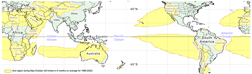
Map of arid regions during Northern Hemisphere summer based on IMERG data from 1998–2025
The yellow regions in the above image are where no more than 9 inches of rain falls during May through October, on average. In comparison, this amount is less than half of the typical May-to-October accumulation over the United States East Coast.
In the image below, the top panel uses percent anomalies to show how MISO's influence on precipitation extends into arid regions. Deep red or blue shows where precipitation during phase 1 of MISO is 50% lower or higher than normal, respectively.
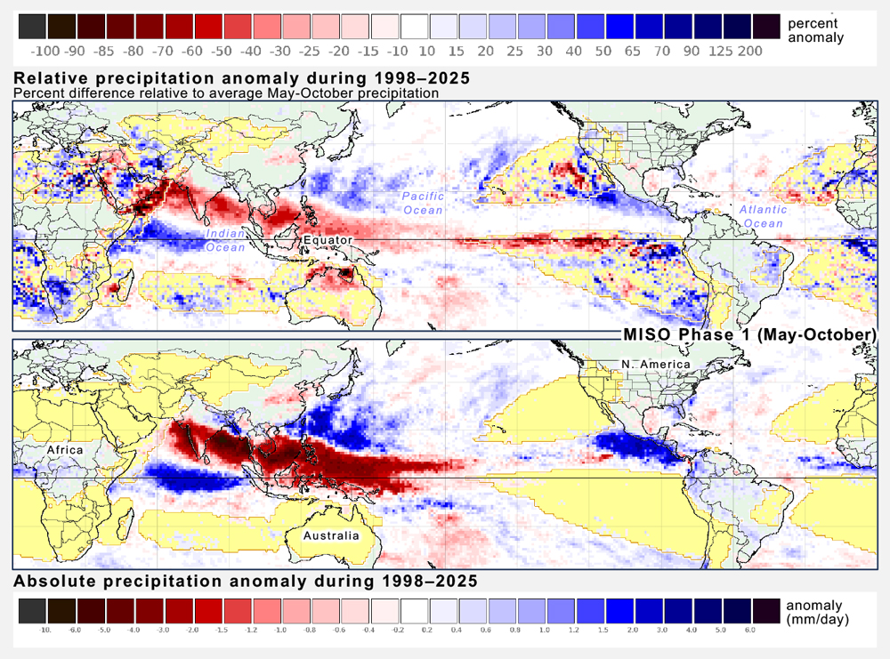
Comparison of relative and absolute anomalies during MISO Phase 1.
In deep red, the bottom panel shows a precipitation deficit over India using an absolute scale, but the top panel shows that this deficit actually extends all the way onto the Arabian Peninsula using a percent-anomaly scale. In deep blue, the bottom panel shows excess precipitation near the Equator next to South America and Africa, but the top panel shows that this excess actually extends onto some of the arid regions of these continents if percent anomalies are displayed.
Final Thoughts
The long record and global extent of NASA's IMERG dataset make it useful for studying how precipitation is affected by the El Niño / Southern Oscillation and Madden-Julian Oscillation. For both oscillations, their strongest precipitation signal is an east-west displacement of precipitation in the tropics over the Indian and Pacific Oceans. Percent-anomaly maps show that these oscillations also affect precipitation in the Northern Hemisphere's subtropics and midlatitudes where most of the world's population lives (23.5–66.5ºN latitude).
There are several considerations that motivate scientific study and operational monitoring of atmospheric oscillations. For example, food production depends on the timing and amount of rain. Severe storms periodically threaten property and lives in many parts of the world.
Credit: Imagery and text by Owen Kelley (NASA PPS / GMU CEOSR) and Jason West (NASA PPS / KBR).
Notes
[1] The annual and diurnal cycles of precipitation are very different things than the water cycle. The water cycle is a sequence of steps by which water flows from on or below the Earth's surface to the atmosphere and back. Precipitation is one step of the water cycle.
[2] On June 17, 2026, Fortune Magazine published an article that mentioned a 2023 scientific study published in the journal Science that found that a powerful El Niño can cause $6 trillion of harm to the world economy. This article discusses El Niño and MJO. MJO is sometimes described as a high-frequency perturbation on top of El Niño, so just as El Niño has economic impact, so does MJO.
[3] The distinction made here between precipitation cycles and oscillations isn't found in most textbooks or websites, but it is made informally when atmospheric scientists talk among themselves. That being said, a few scientific papers treat the terms oscillation and cycle if they were interchangeable. While discussing variation in precipitation, Grimm (2019) refers to the "cycle" of the Madden-Julian Oscillation. Liu et al. (2020) and Gutzler et al. (2002) mention the El Niño-Southern Oscillation "cycle".
[4] Enfield (1989) discusses the history of when scientists realized El Niño events were connected with the Southern Oscillation.
[5] Kiladis et al. (2014) published the definition of the OMI, which stands for outgoing longwave-radiation (OLR) MJO index. The values of OMI can be found on the NOAA Physical Sciences Laboratory's MJO page.
[6] Even though scientists use a single index for the MJO during all months of the year, some scientists calculate separate rainfall anomalies for northern-hemisphere and southern-hemisphere summer: November-April and May-October. They call one anomaly MJO and the other anomaly MISO. This distinction is made later in this article.
[7] The software that generated these images used Jan Null's list of years with moderate or strong El Niño or La Niña events. The software averaged IMERG precipitation during the 12 months associated with each event, taking observations from July of the year that the event started through June of the next year. This 12-month period is chosen because ENSO events tend to reach their maximum strength within a few months before or after December.
[8] Santoso et al. (2017) discuss the 2015-2016 El Niño which was the strongest one since the 1997-1998 El Niño. An article on the GPM website describes IMERG observations of the 2015-16 El Niño.
[9] Bai and Schumacher 2022 and Xianan et al., 2020.
[10] The MJO's ability to influence severe weather is mentioned in Klotzbach et al. (2023) and in an earlier post to the GPM website about Tropical Cyclone Ana (2021).
[11] First, the 28-years of 24-hour IMERG estimates has its linear trend removed. Then, the seasonal cycle is subtracted. This means calculating the average precipitation rate for a given day of the year and subtracting that average from the 28-years of data. The 20-to-90-day variations in precipitation are extracted from the time series using the Lanczos bandpass filter. An index is used to identify the days in the time series that have a strong expression of one of the eight MJO phases (an OMI amplitude of ≥1). The average precipitation is calculated separately for each phase and for the Northern Hemisphere summer or winter. The MJO index used in this analysis is NOAA's ROMI, which stands for Realtime Outgoing Longwave Radiation (OLR) MJO Index.
[12] For the North and South America pattern, see Figure 12 of Fernandes and Grimm (2023). A less technical account is provided by Arcodia (2020).